Last updated on June 3, 2020
5 Python Libraries for Reporting and Factsheets
Posted by Felix Zumstein - Comments
Python is a popular tool for all kind of automation needs and therefore a great candidate for your reporting tasks. There is a wealth of techniques and libraries available and we’re going to introduce five popular options here. After reading this blog post, you should be able to pick the right library for your next reporting project according to your needs and skill set.
Table of Contents
Overview
Before we begin, here is a high level comparison of the libraries presented in this post:
| Library | Technology | Summary |
|---|---|---|
| Pandas + HTML | HTML | You can generate beautiful reports in the form of static web pages if you know your way around HTML + CSS. The HTML report can also be turned into a PDF for printing. |
| Pandas + Excel | Excel | This is a great option if the report has to be in Excel. It can be run on a server where Excel is not installed, i.e. it’s an ideal candidate for a “download to Excel” button in a web app. The Excel file can be exported to PDF. |
| xlwings | Excel | xlwings allows the use of an Excel template so the formatting can be done by users without coding skills. It requires, however, an installation of Excel so it’s a good option when the report can be generated on a desktop, e.g. for ad-hoc reports. The Excel file can be exported to PDF. |
| Plotly Dash | HTML | Dash allows you to easily spin up a great looking web dashboard that is interactive without having to write any JavaScript code. If formatted properly, it can be used as a source for PDFs, too. Like Pandas + HTML, it requires good HTML + CSS skills to make it look the way you want. |
| Datapane | HTML | Datapane allows you to create HTML reports with interactive elements. It also offers a hosted solution so end users can change the input parameters that are used to create these reports. |
| ReportLab | ReportLab creates direct PDF files without going through HTML or Excel first. It’s very fast and powerful but comes with a steep learning curve. Used by Wikipedia for their PDF export. |
Pandas
I am probably not exaggerating when I claim that almost all reporting in Python starts with Pandas. It’s incredibly easy to create Pandas DataFrames with data from databases, Excel and csv files or json responses from a web API. Once you have the raw data in a DataFrame, it only requires a few lines of code to clean the data and slice & dice it into a digestible form for reporting. Accordingly, Pandas will be used in all sections of this blog post, but we’ll start by leveraging the built-in capabilities that Pandas offers for reports in Excel and HTML format.
Pandas + Excel
Required libraries: pandas, xlsxwriter
If you want to do something slightly more sophisticated than just dumping a DataFrame into an Excel spreadsheet, I found that Pandas and XlsxWriter is the easiest combination, but others may prefer OpenPyXL. In that case you should be able to easily adopt this snippet by replacing engine='xlsxwriter' with engine='openpyxl' and changing the book/sheet syntax so it works with OpenPyXL:
import pandas as pd
import numpy as np

# Sample DataFrame
df = pd.DataFrame(np.random.randn(5, 4), columns=['one', 'two', 'three', 'four'],
                  index=['a', 'b', 'c', 'd', 'e'])

# Dump Pandas DataFrame to Excel sheet
writer = pd.ExcelWriter('myreport.xlsx', engine='xlsxwriter')
df.to_excel(writer, sheet_name='Sheet1', startrow=2)

# Get book and sheet objects for futher manipulation below
book = writer.book
sheet = writer.sheets['Sheet1']

# Title
bold = book.add_format({'bold': True, 'size': 24})
sheet.write('A1', 'My Report', bold)

# Color negative values in the DataFrame in red
format1 = book.add_format({'font_color': '#E93423'})
sheet.conditional_format('B4:E8', {'type': 'cell', 'criteria': '<=', 'value': 0, 'format': format1})

# Chart
chart = book.add_chart({'type': 'column'})
chart.add_series({'values': '=Sheet1!B4:B8', 'name': '=Sheet1!B3', 'categories': '=Sheet1!$A$4:$A$8'})
chart.add_series({'values': '=Sheet1!C4:C8', 'name': '=Sheet1!C3'})
chart.add_series({'values': '=Sheet1!D4:D8', 'name': '=Sheet1!D3'})
chart.add_series({'values': '=Sheet1!E4:E8', 'name': '=Sheet1!E3'})
sheet.insert_chart('A10', chart)

writer.save()
Running this will produce the following report:
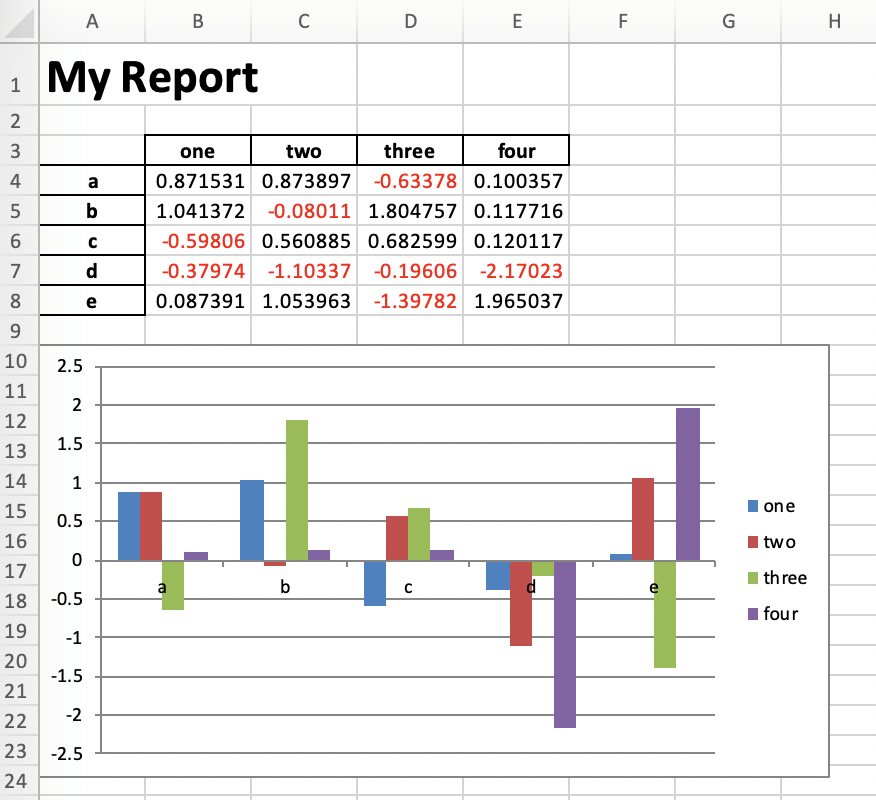
Of course, we could now go back to the script and add more code to style it a bit nicer, but I leave this as an exercise to the reader…
Pandas + HTML
Required libraries: pandas, jinja2
Creating an HTML report with pandas works similar to what’ve just done with Excel: If you want a tiny bit more than just dumping a DataFrame as a raw HTML table, then you’re best off by combining Pandas with a templating engine like Jinja:
First, let’s create a file called template.html:
<html>
<head>
    <style>
        * {
            font-family: sans-serif;
        }
        body {
            padding: 20px;
        }
        table {
            border-collapse: collapse;
            text-align: right;
        }
        table tr {
            border-bottom: 1px solid
        }
        table th, table td {
            padding: 10px 20px;
        }
    </style>
</head>
<body>

<h1>My Report</h1>

{{ my_table }}

<img src='plot.svg' width="600">

</body>
</html>
Then, in the same directory, let’s run the following Python script that will create our HTML report:
import pandas as pd
import numpy as np
import jinja2

# Sample DataFrame
df = pd.DataFrame(np.random.randn(5, 4), columns=['one', 'two', 'three', 'four'],
                  index=['a', 'b', 'c', 'd', 'e'])

# See: https://pandas.pydata.org/pandas-docs/stable/user_guide/style.html#Building-styles
def color_negative_red(val):
    color = 'red' if val < 0 else 'black'
    return f'color: {color}'

styler = df.style.applymap(color_negative_red)

# Template handling
env = jinja2.Environment(loader=jinja2.FileSystemLoader(searchpath=''))
template = env.get_template('template.html')
html = template.render(my_table=styler.render())

# Plot
ax = df.plot.bar()
fig = ax.get_figure()
fig.savefig('plot.svg')

# Write the HTML file
with open('report.html', 'w') as f:
    f.write(html)
The result is a nice looking HTML report that could also be printed as a PDF by using something like WeasyPrint:
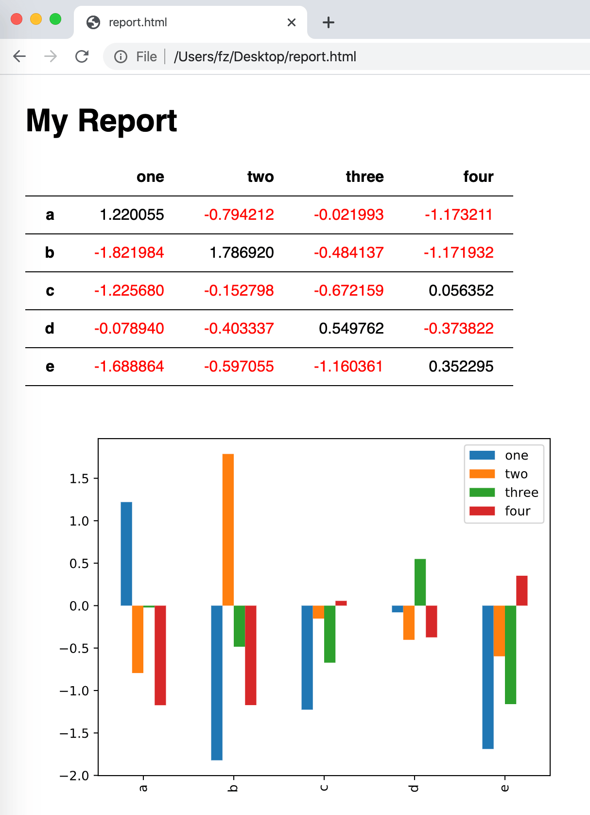
Note that for such an easy example, you wouldn’t necessarily need to use a Jinja template. But when things start to become more complex, it’ll definitely come in very handy.
xlwings
xlwings allows you to program and automate Excel with Python instead of VBA. The difference to XlsxWriter or OpenPyXL (used above in the Pandas section) is the following: XlsxWriter and OpenPyXL write Excel files directly on disk. They work wherever Python works and don’t require an installation of Microsoft Excel. xlwings, on the other hand, can write, read and edit Excel files via the Excel application, i.e. a local installation of Microsoft Excel is required. xlwings also allows you to create macros and user-defined functions in Python rather than in VBA, but for reporting purposes, we won’t really need that.
While XlsxWriter/OpenPyXL are the best choice if you need to produce reports in a scalable way on your Linux web server, xlwings does have the advantage that it can edit pre-formatted Excel files without losing or destroying anything. OpenPyXL on the other hand (the only writer library with xlsx editing capabilities) will drop some formatting and sometimes leads to Excel raising errors during further manual editing.
xlwings (Open Source)
Replicating the sample we had under Pandas is easy enough with the open-source version of xlwings:
import xlwings as xw
import pandas as pd
import numpy as np

# Open a template file
wb = xw.Book('mytemplate.xlsx')

# Sample DataFrame
df = pd.DataFrame(np.random.randn(5, 4), columns=['one', 'two', 'three', 'four'],
                  index=['a', 'b', 'c', 'd', 'e'])

# Assign data to cells
wb.sheets[0]['A1'].value = 'My Report'
wb.sheets[0]['A3'].value = df

# Save under a new file name
wb.save('myreport.xlsx')
Running this will produce the following report:
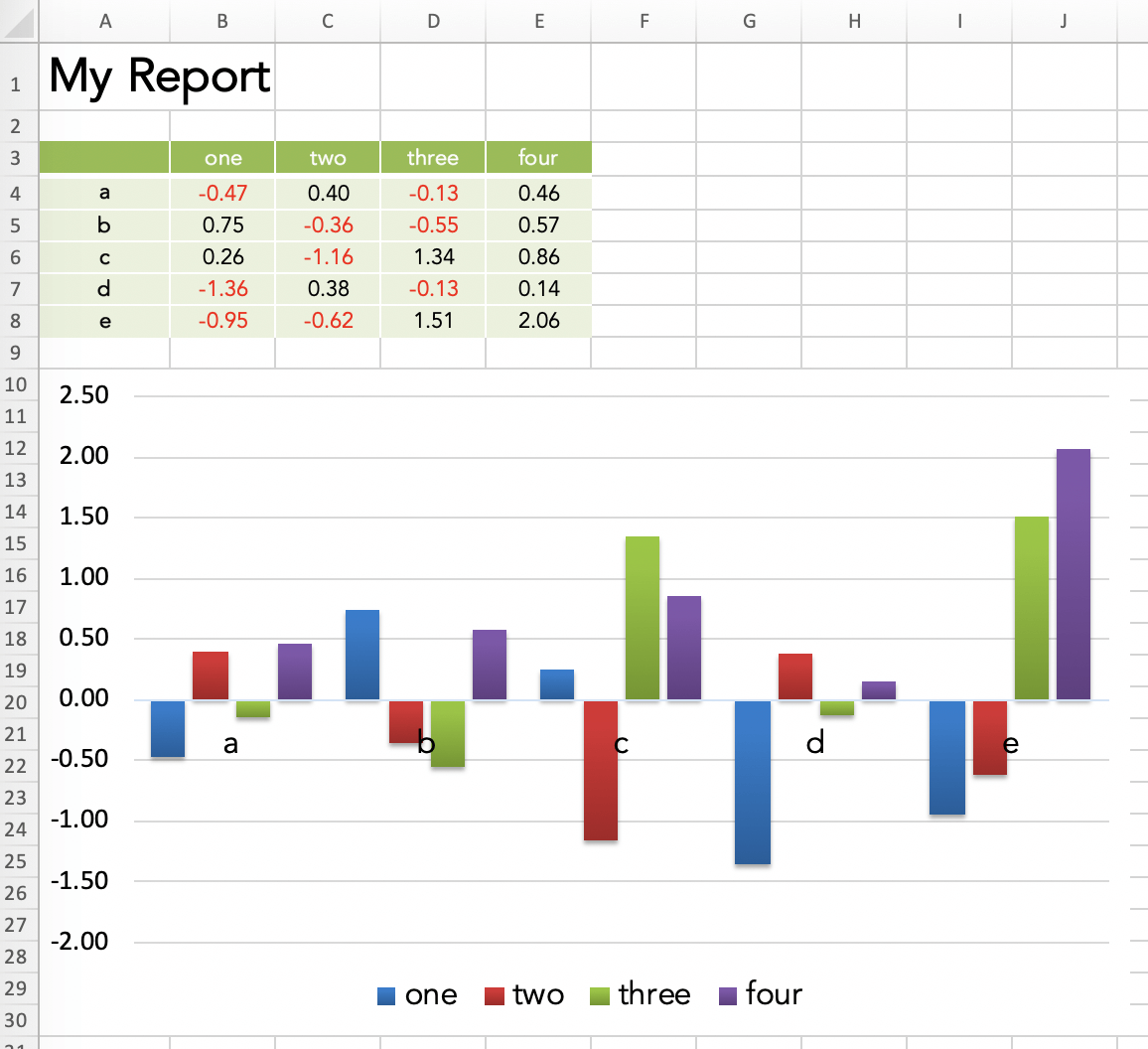
So where does all the formatting come from? The formatting is done directly in the Excel template before running the script. This means that instead of having to program tens of lines of code to format a single cell with the proper font, colors and borders, I can just make a few clicks in Excel. xlwings then merely opens the template file and inserts the values.
This allows us to create a good looking report in your corporate design very fast. The best part is that the Python developer doesn’t necessarily have to do the formatting but can leave it to the business user who owns the report.
Note that you could instruct xlwings to run the report in a separate and hidden instance of Excel so it doesn’t interfere with your other work.
xlwings PRO
The Pandas + Excel as well as the xlwings (open source) sample both have a few issues:
- If, for example, you insert a few rows below the title, you will have to adjust the cell references accordingly in the Python code. Using named ranges could help but they have other limitations (like the one mentioned at the end of this list).
- The number of rows in the table might be dynamic. This leads to two issues: (a) data rows might not be formatted consistently and (b) content below the table might get overwritten if the table is too long.
- Placing the same value in a lot of different cells (e.g. a date in the source note of every table or chart) will cause duplicated code or unnecessary loops.
To fix these issues, xlwings PRO comes with a dedicated reports package:
- Separation of code and design: Users without coding skills can change the template on their own without having to touch the Python code.
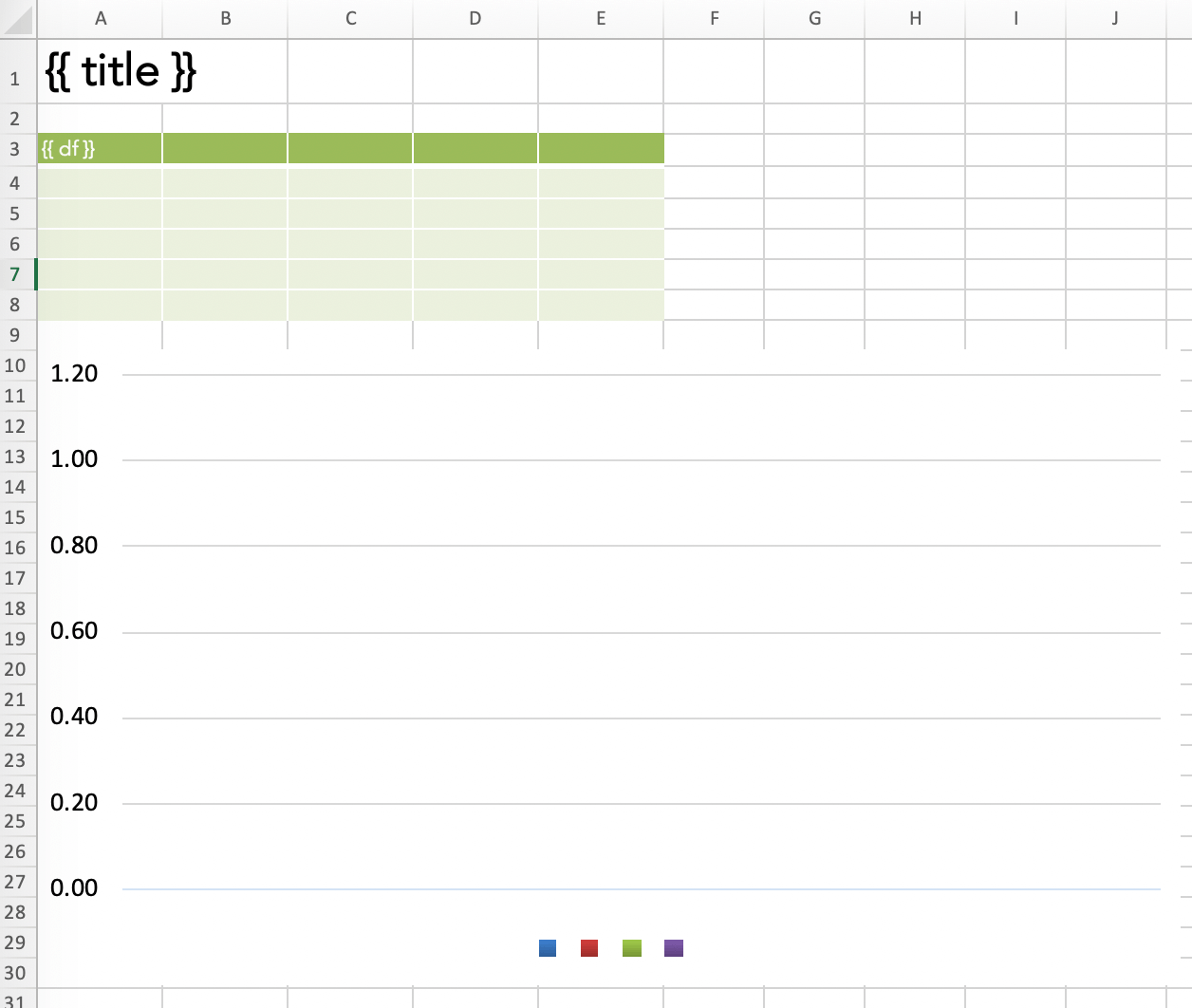
- Template variables: Python variables (between double curly braces) can be directly used in cells , e.g.
{{ title }}. They act as placeholders that will be replaced by the values of the variables. - Frames for dynamic tables: Frames are vertical containers that dynamically align and style tables that have a variable number of rows. To see how Frames work, have a look at the documentation.
You can get a free trial for xlwings PRO here. When using the xlwings PRO reports package, your code simplifies to the following:
import pandas as pd
import numpy as np
from xlwings.pro.reports import create_report  # part of xlwings PRO

# Sample DataFrame
df = pd.DataFrame(np.random.randn(5, 4), columns=['one', 'two', 'three', 'four'],
                  index=['a', 'b', 'c', 'd', 'e'])

# Create the report by passing in all variables as kwargs
wb = create_report('mytemplate.xlsx',
                   'myreport.xlsx',
                   title='My Report',
                   df=df)
All that’s left is to create a template with the placeholders for title and df:
Running the script will produce the same report that we generated with the open source version of xlwings above. The beauty of this approach is that there are no hard coded cell references anymore in your Python code. This means that the person who is responsible for the layout can move the placeholders around and change the fonts and colors without having to bug the Python developer anymore.
Plotly Dash
Required libraries: pandas, dash
Plotly is best known for their beautiful and open-source JavaScript charting library which builds the core of Chart Studio, a platform for collaboratively designing charts (no coding required).
To create a report though, we’re using their latest product Plotly Dash, an open-source framework that allows the creation of interactive web dashboards with Python only (no need to write JavaScript code). Plotly Dash is also available as Enterprise plan.
How it works is best explained by looking at some code, adopted with minimal changes from the official getting started guide:
import pandas as pd
import dash
import dash_core_components as dcc
import dash_html_components as html
from dash.dependencies import Input, Output

# Sample DataFrame
df = pd.read_csv('https://raw.githubusercontent.com/plotly/datasets/master/gapminderDataFiveYear.csv')

# Dash app - The CSS code is pulled in from an external file
app = dash.Dash(__name__, external_stylesheets=['https://codepen.io/chriddyp/pen/bWLwgP.css'])

# This defines the HTML layout
app.layout = html.Div([
    html.H1('My Report'),
    dcc.Graph(id='graph-with-slider'),
    dcc.Slider(
        id='year-slider',
        min=df['year'].min(),
        max=df['year'].max(),
        value=df['year'].min(),
        marks={str(year): str(year) for year in df['year'].unique()},
        step=None
    )
])

# This code runs every time the slider below the chart is changed
@app.callback(Output('graph-with-slider', 'figure'), [Input('year-slider', 'value')])
def update_figure(selected_year):
    filtered_df = df[df.year == selected_year]
    traces = []
    for i in filtered_df.continent.unique():
        df_by_continent = filtered_df[filtered_df['continent'] == i]
        traces.append(dict(
            x=df_by_continent['gdpPercap'],
            y=df_by_continent['lifeExp'],
            text=df_by_continent['country'],
            mode='markers',
            opacity=0.7,
            marker={'size': 15, 'line': {'width': 0.5, 'color': 'white'}},
            name=i
        ))

    return {
        'data': traces,
        'layout': dict(
            xaxis={'type': 'log', 'title': 'GDP Per Capita', 'range': [2.3, 4.8]},
            yaxis={'title': 'Life Expectancy', 'range': [20, 90]},
            margin={'l': 40, 'b': 40, 't': 10, 'r': 10},
            legend={'x': 0, 'y': 1},
            hovermode='closest',
            transition={'duration': 500},
        )
    }

if __name__ == '__main__':
    app.run_server(debug=True)
Running this script and navigating to http://localhost:8050 in your browser will give you this dashboard:
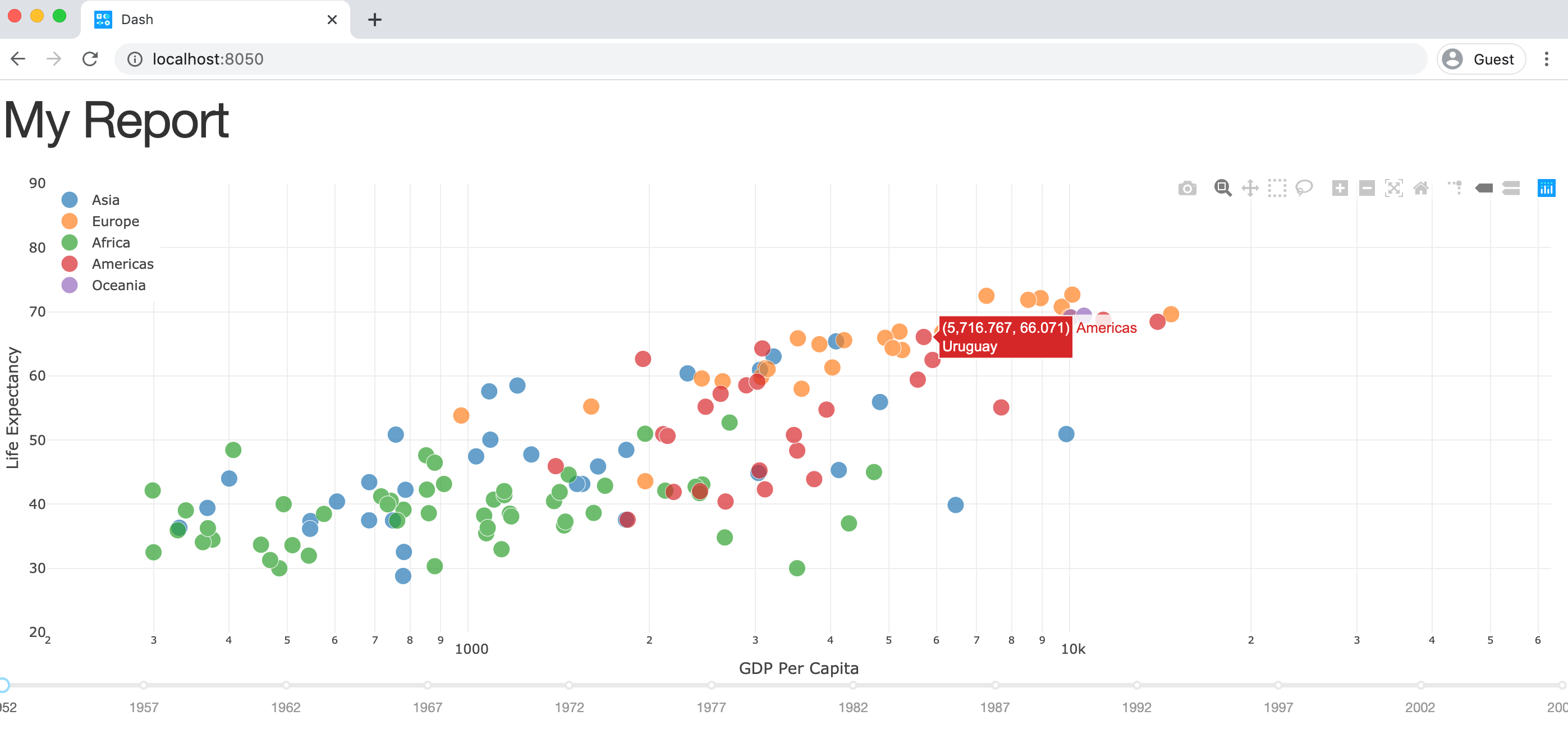
The charts look great by default and it’s very easy to make your dashboard interactive by writing simple callback functions in Python: You can choose the year by clicking on the slider below the chart. In the background, every change to our year-slider will trigger the update_figure callback function and hence update the chart.
By arranging your documents properly, you could create an interactive web dashboard that can also act as the source for your PDF factsheet, see for example their financial factsheet demo together with it’s source code.
Alternatives to Plotly Dash
If you are looking for an alternative to Plotly Dash, make sure to check out Panel. Panel was originally developed with the support of Anaconda Inc., and is now maintained by Anaconda developers and community contributors. Unlike Plotly Dash, Panel is very inclusive and supports a wide range of plotting libraries including: Bokeh, Altair, Matplotlib and others (including also Plotly).
Datapane
Required libraries: datapane
Datapane is a framework for reporting which allows you to generate interactive reports from pandas DataFrames, Python visualisations (such as Bokeh and Altair), and Markdown. Unlike solutions such as Dash, Datapane allows you to generate standalone reports which don’t require a running Python server—but it doesn’t require any HTML coding either.
Using Datapane, you can either generate one-off reports, or deploy your Jupyter Notebook or Python script so others can generate reports dynamically by entering parameters through an automatically generated web app.
Datapane (open-source library)
Datapane’s open-source library allows you to create reports from components, such as a Table component, a Plot component, etc. These components are compatible with Python objects such as pandas DataFrames, and many visualisation libraries, such as Altair:
import datapane as dp
import pandas as pd
import altair as alt
df = pd.read_csv('https://query1.finance.yahoo.com/v7/finance/download/GOOG?period2=1585222905&interval=1mo&events=history')
chart = alt.Chart(df).encode(
x='Date:T',
y='Open'
).mark_line().interactive()
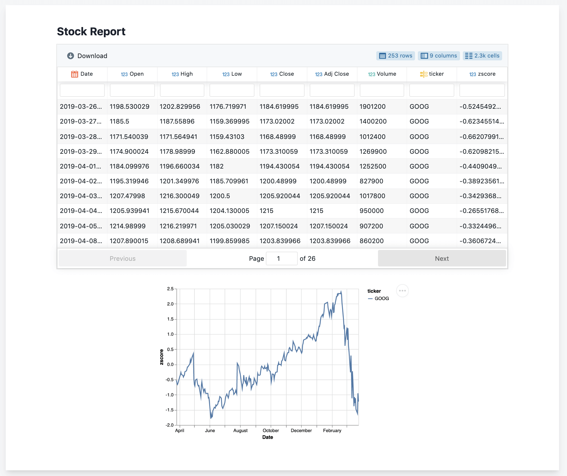
r = dp.Report(dp.Table(df), dp.Plot(chart))
r.save(path='report.html')
This code renders a standalone HTML document with an interactive, searchable table and plot component.
If you want to publish your report, you can login to Datapane (via $ datapane login) and use the publish method, which will give you a URL such as this which you can share or embed.
r.publish(name='my_report')
Hosted Reporting Apps
Datapane can also be used to deploy Jupyter Notebooks and Python scripts so that other people who are not familiar with Python can generate custom reports. By adding a YAML file to your folder, you can specify input parameters as well as dependencies (through pip, Docker, or local folders). Datapane also has support for managing secret variables, such as database passwords, and for storing and persisting files. Here is a sample script (stocks.py) and YAML file (stocks.yaml):
# stocks.py
import datapane as dp
import altair as alt
import yfinance as yf

dp.Params.load_defaults('./stocks.yaml')

tickers = dp.Params.get('tickers')
plot_type = dp.Params.get('plot_type')
period = dp.Params.get('period')
data = yf.download(tickers=' '.join(tickers), period=period, groupby='ticker').Close

df = data.reset_index().melt('Date', var_name='symbol', value_name='price')
base_chart = alt.Chart(df).encode(x='Date:T', y='price:Q', color='symbol').interactive()
chart = base_chart.mark_line() if plot_type == 'line' else base_chart.mark_bar()
dp.Report(dp.Plot(chart), dp.Table(df)).publish(name=f'stock_report', headline=f'Report on {" ".join(tickers)}')
# stocks.yaml
name: stock_analysis
script: stocks.py
# Script parameters
parameters:
  - name: tickers
    description: A list of tickers to plot
    type: list
    default: ['GOOG', 'MSFT', 'IBM']
  - name: period
    description: Time period to plot
    type: enum
    choices: ['1d','5d','1mo','3mo','6mo','1y','2y','5y','10y','ytd','max']
    default: '1mo'
  - name: plot_type
    type: enum
    default: line
    choices: ['bar', 'line']

## Python packages required for the script
requirements:
  - yfinance
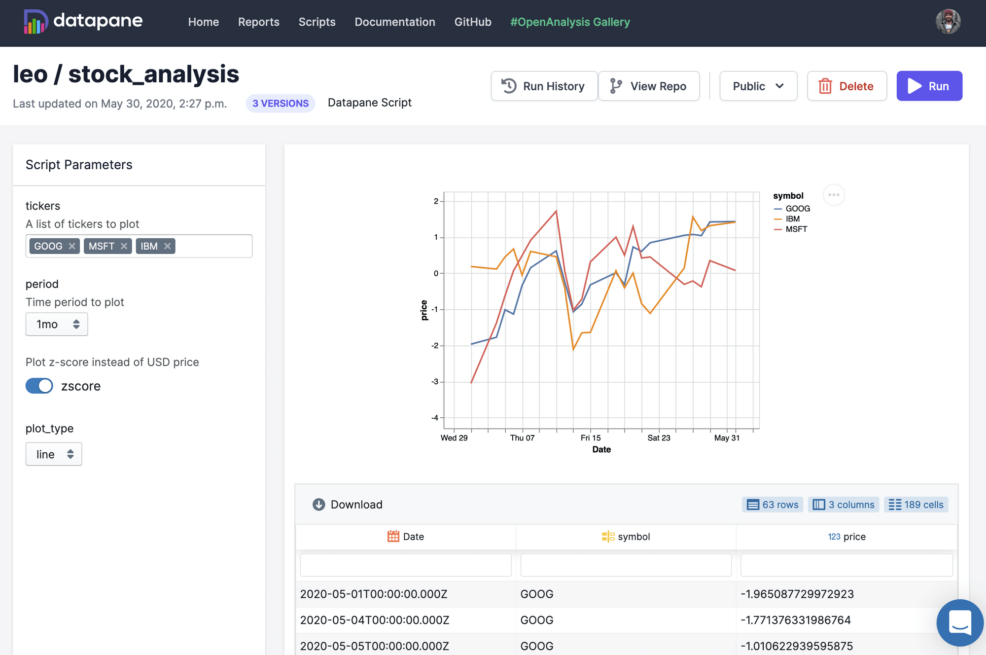
Publishing this into a reporting app is easy as running $ datapane script deploy. For a full example see this example GitHub repository or read the docs.
ReportLab
Required libraries: pandas, reportlab
ReportLab writes PDF files directly. Most prominently, Wikipedia uses ReportLab to generate their PDF exports. One of the key strength of ReportLab is that it builds PDF reports “at incredible speeds”, to cite their homepage. Let’s have a look at some sample code for both the open-source and the commercial version!
ReportLab OpenSource
In its most basic functionality, ReportLab uses a canvas where you can place objects using a coordinate system:
from reportlab.pdfgen import canvas
c = canvas.Canvas("hello.pdf")
c.drawString(50, 800, "Hello World")
c.showPage()
c.save()
ReportLab also offers an advanced mode called PLATYPUS (Page Layout and Typography Using Scripts), which is able to define dynamic layouts based on templates at the document and page level. Within pages, Frames would then arrange Flowables (e.g. text and pictures) dynamically according to their height. Here is a very basic example of how you put PLATYPUS at work:
import pandas as pd
import numpy as np
from reportlab.pdfgen.canvas import Canvas
from reportlab.lib import colors
from reportlab.lib.styles import getSampleStyleSheet
from reportlab.lib.units import inch
from reportlab.platypus import Paragraph, Frame, Table, Spacer, TableStyle
# Sample DataFrame
df = pd.DataFrame(np.random.randn(5, 4), columns=['one', 'two', 'three', 'four'],
index=['a', 'b', 'c', 'd', 'e'])
# Style Table
df = df.reset_index()
df = df.rename(columns={"index": ""})
data = [df.columns.to_list()] + df.values.tolist()
table = Table(data)
table.setStyle(TableStyle([
('INNERGRID', (0, 0), (-1, -1), 0.25, colors.black),
('BOX', (0, 0), (-1, -1), 0.25, colors.black)
]))
# Components that will be passed into a Frame
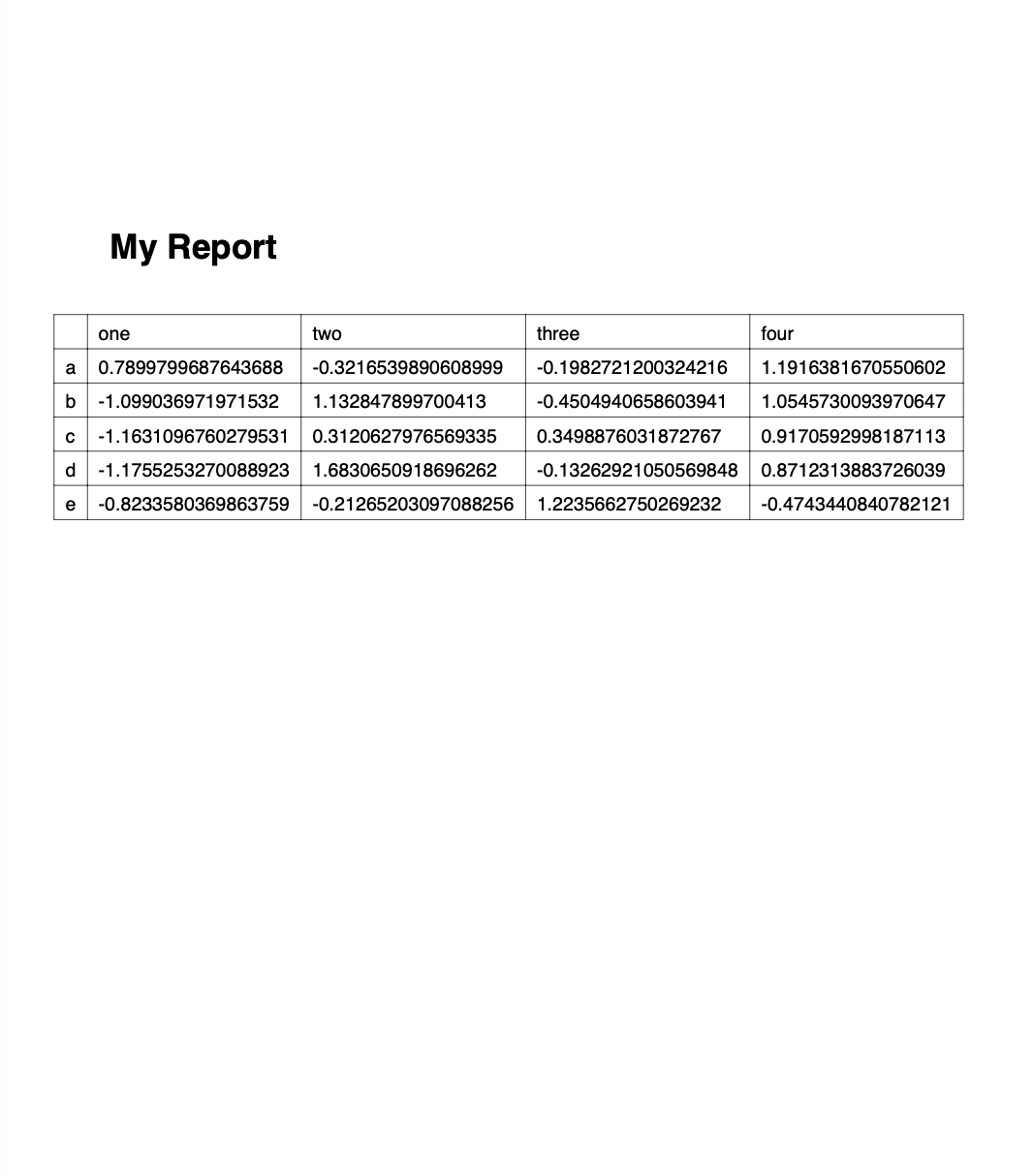
story = [Paragraph("My Report", getSampleStyleSheet()['Heading1']),
Spacer(1, 20),
table]
# Use a Frame to dynamically align the compents and write the PDF file
c = Canvas('report.pdf')
f = Frame(inch, inch, 6 * inch, 9 * inch)
f.addFromList(story, c)
c.save()
Running this script will produce the following PDF:
ReportLab PLUS
In comparison to the open-source version of ReportLab, the most prominent features of Reportlab PLUS are
- a templating language
- the ability to include vector graphics
The templating language is called RML (Report Markup Language), an XML dialect. Here is a sample of how it looks like, taken directly from the official documentation:
<!DOCTYPE document SYSTEM "rml.dtd">
<document filename="example.pdf">
    <template>
        <pageTemplate id="main">
            <frame id="first" x1="72" y1="72" width="451" height="698" />
        </pageTemplate>
    </template>
    <stylesheet>
    </stylesheet>
    <story>
        <para>
            This is the "story". This is the part of the RML document where
            your text is placed.
        </para>
        <para>
            It should be enclosed in "para" and "/para" tags to turn it into
            paragraphs.
        </para>
    </story>
</document>
The idea here is that you can have any program produce such an RML document, not just Python, which can then be transformed into a PDF document by ReportLab PLUS.
Conclusion
Python offers various libraries to create professional reports and factsheets. If you are a good at HTML + CSS have a look at Plotly Dash or Panel or write your HTML documents directly with the help of the to_html method in Pandas.
If you need your report as Excel file (or if you hate CSS), Pandas + XlsxWriter/OpenPyXL or xlwings might be the right choice - you can still export your Excel document as PDF file. xlwings is the better choice if you want to split the design and code work. XlsxWriter/OpenPyxl is the better choice if it needs to be scalable and run on a server.
If you need to generate PDF files at high speed, check out ReportLab. It has a steep learning curve and requires to write quite some code but once the code has been written, it works at high speed.